We understand, you always look for platforms and dashboards that are easy to use. So, the Trakzee – Fleet Management Platform always tries to be user-friendly. Today, we will discuss the new change in the Trakzee web platform.
Trakzee introduces a brand new customizable Dashboard. It is easy to understand and also provides all the useful information you need on a single screen. It has all the data ranging from Vehicle Status and Utilization to Expenses, Reminders, and even your Object Health.
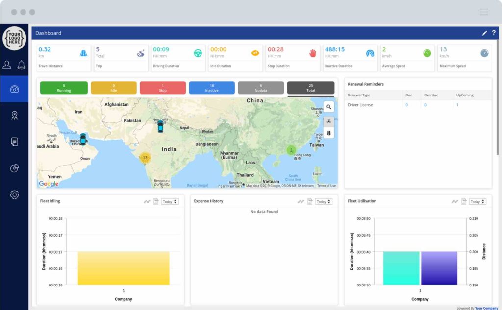
Let’s see the new changes in the platform. The below image is exactly how the new dashboard will look.
Dashboard New Features…
-
Fleet Distance and Duration Summary
The top of the dashboard shows the total amount of distance traveled by your fleet for the day along with the trip and duration-related information such as the number of trips of your fleet, total driving duration, idle duration, stop duration, inactive duration, and the average and maximum speed attained by the vehicles of your fleet.
-
Object status and map
Next is the part that shows you the number of objects in each status such as running, idle, stop, inactive, and no data.
Then is the map, it will show the live location of each object in your fleet. When you click on the color that represents each status, the map will show only those vehicles. When an object is clicked, then the details of that object, such as its name, current speed, and the live address will be shown. You also have the option to toggle between Cluster view and Traffic details.
-
Graph
The screen provides various graphs which are:
- Fleet Utilization: This graph shows the running duration and distance by the objects in each company
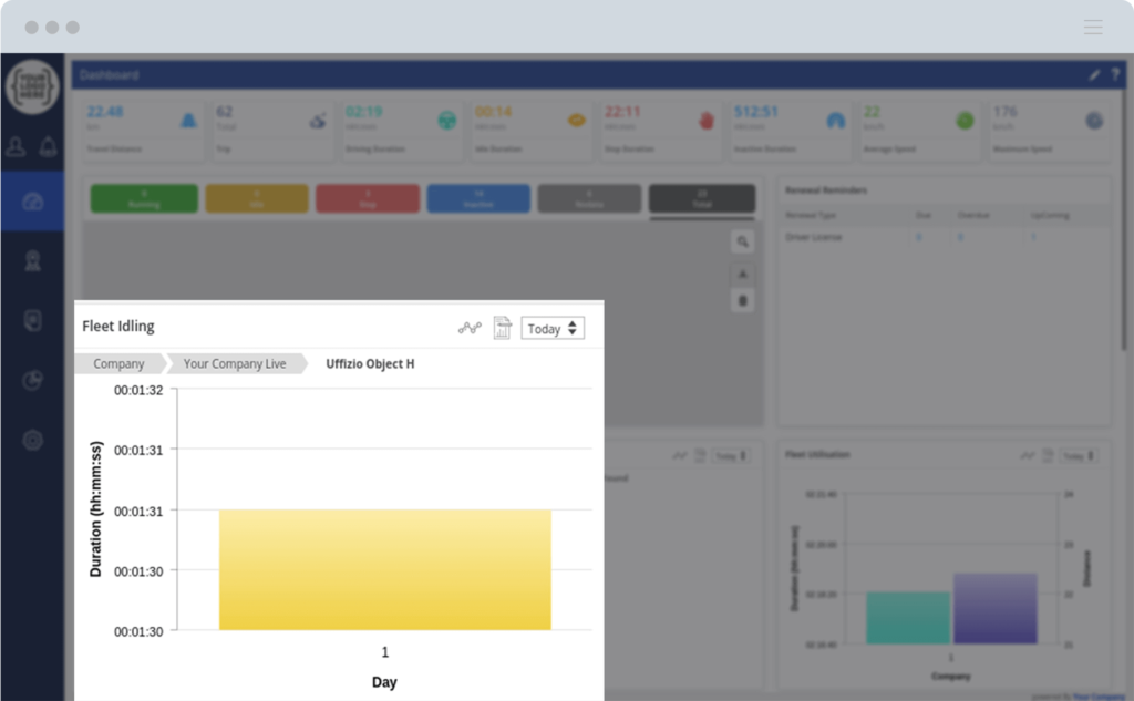
- Fleet Idling: This graph shows the total idle duration for each company
- Expense History: This graph shows the expenses for fuel and maintenance for each company along with the total amount
- Project vs Total Object: This graph will show you the total number of vehicles in each project for the admin or reseller
- Fleet Parking: This graph shows the total stoppage duration for each company
- Object Health: This section will show you the number of objects with their health state which is minor, major, and critical
- GPS Model Summary: This graph shows the number of GPS Device Models used by each company
- Object Statics: This graph shows the number of Objects added and deleted for the selected duration.
- Maintenance Reminder: This section shows you the number of Due, Overdue, and Upcoming maintenance reminders
- Fleet Violation: This graph shows the number of violations done by the Objects under each company.
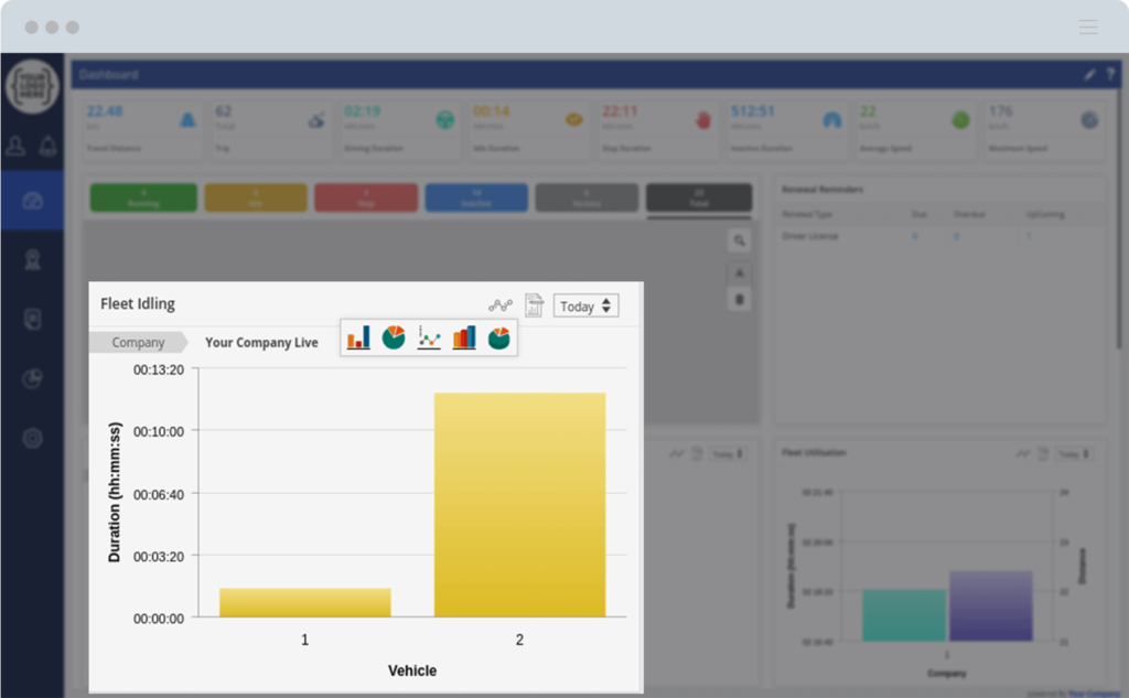
Let’s see the options of the graph by taking the example of Fleet Idling.
To switch between various graphs you can click on the icon. Then you can select any graph you prefer as shown below:
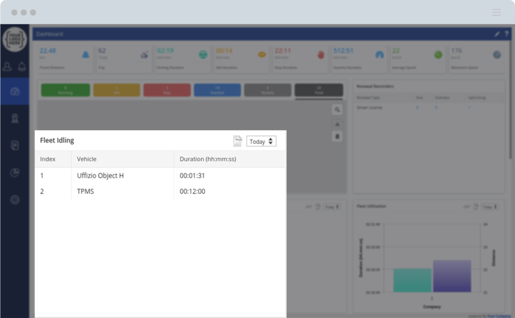
Also, you can switch to a textual view by clicking on the icon and it will appear as below:
To open the graph for a different date you can select the required duration from the date picker:
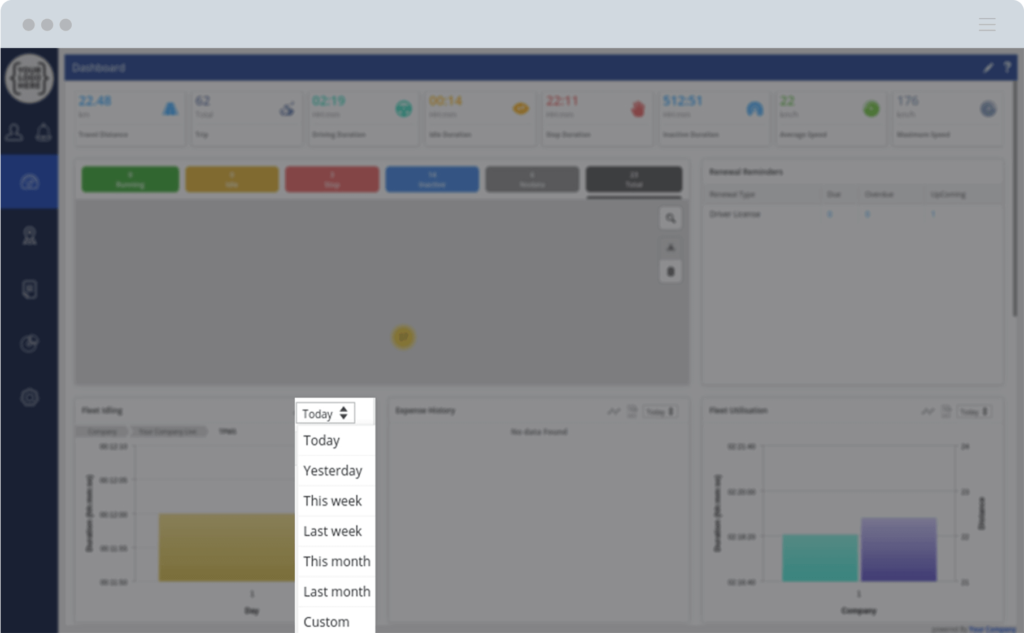
The above 3 options will remain the same for each graph.
Now, you can go into the detailed graph by clicking on the color represented by any company and it will show the running duration and distance of the objects in that company.
You can go into further details by clicking on the color represented by any object. This will open the graph which shows the running duration and distance traveled by the selected object:
Similarly for each graph, you will get all the data required by selecting the required graph or the icons.
Renewal Reminders
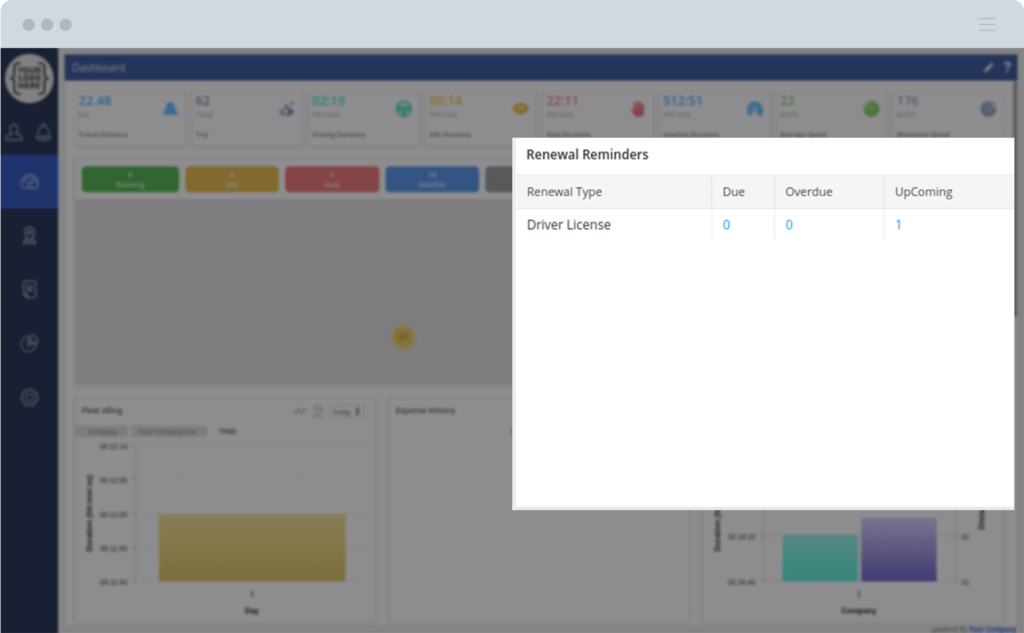
This section will show you the information on the various renewals such as license, Insurance, etc. When you click on the numbers mentioned under Due, Overdue or Upcoming, it will show you the vehicle details for renewal.
These were the various graphs of the new Dashboard which shows various useful information regarding your fleet. But there is an additional feature in the new Dashboard which is customization.
Customization
You will be able to customize your dashboard which you have to click on from the top right corner and you can remove, rearrange, and resize every graph and section of your Dashboard.
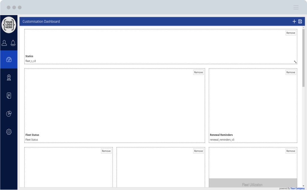
All you have to do is drag each section to particular places on the screen where you would like to view it. And to resize any section you can simply use the resize arrows to increase or decrease their size. Your dashboard will be shown as per your configuration on all your future logins to the portal.
Conclusion
The new dashboard will take you to a new world of simplified information. Information like this is connected to us.


